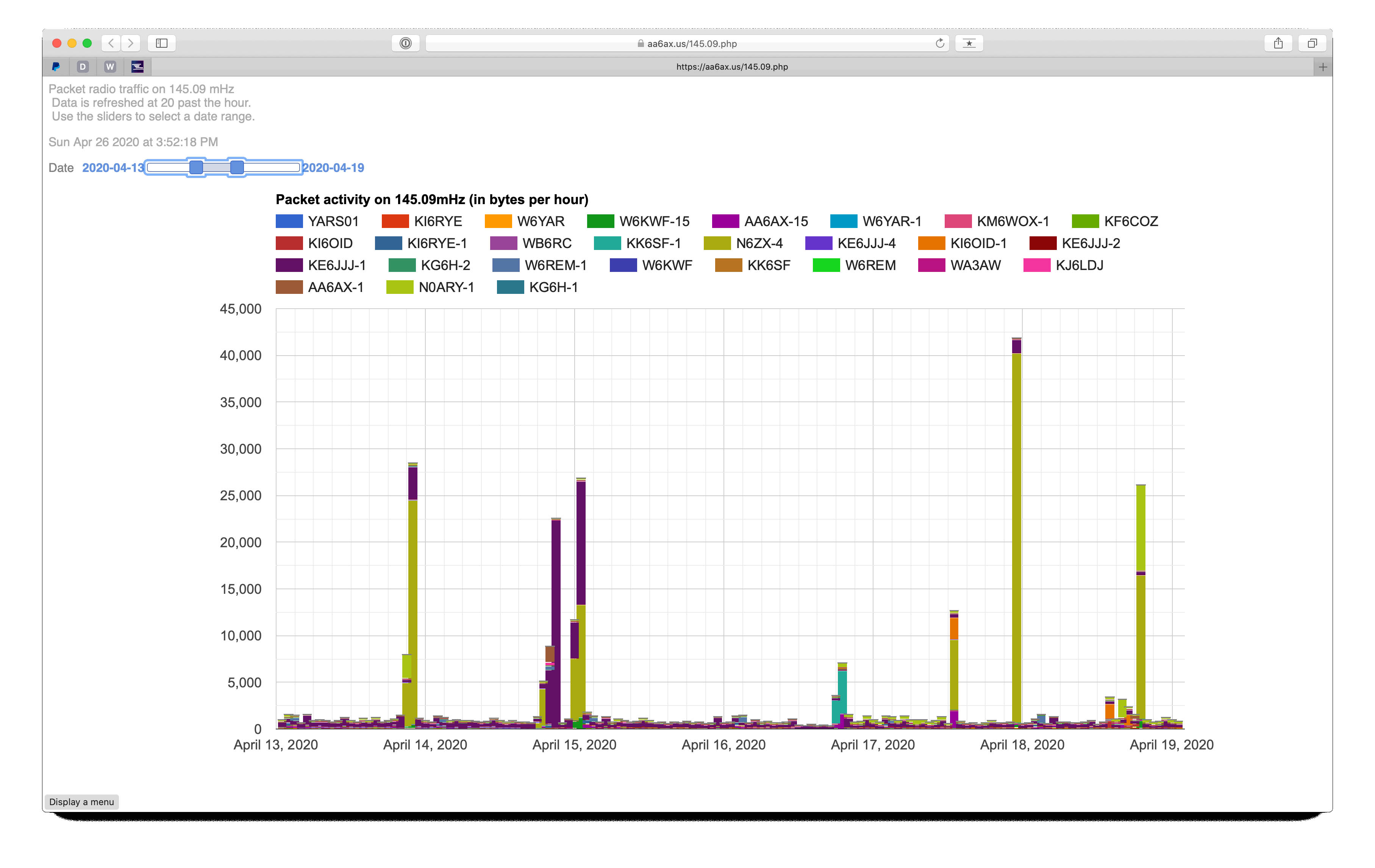
 Very techie here… For a few months I’ve been operating a packet radio station on a 2-meter radio frequency here in the San Francisco Bay Area. I explored what it would take to make this a full “BBS” (like an online “forum”), and then backed off and let it just hang around n this frequency listening to the other (mostly BBS) stations. A few days ago, I got interested in graphing the data to better understand what stations were using the frequency and when.
The chart is made by this process:
- JNOS (the software that runs the packet radio station) logs all data it hears on the radio;
- A Python script analyzes this log file, keeping track of what stations were heard in each hour;
- The Python creates javascript data in a form acceptable to Google Charts;
- The javascript is transferred to a web server;
- PHP code reads the javascript and inserts it in an HTML page;
- Google Charts javascript fashions the data into the interactive chart.
A “cron” job carries out this process once each hour to keep the chart data current. Because each data bucket spans a whole hour, there’s no need to update more than once an hour.
Leave a Reply