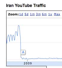
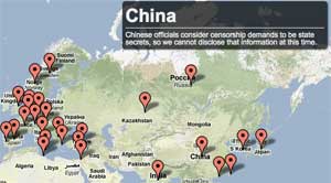
 As a part of their effort to provide greater transparency about the use and blocking of their services, Google provides some interesting information which is available in “real time” online. Their Transparency Report: Traffic shows the relative traffic to their various services by country.
Just for example, if you look at traffic to YouTube from Iran, you’ll see this chart… showing high traffic until June, 2009, when YouTube was blocked in Iran. The scale runs from 0 to 100 and is “normalized” rather than showing absolute bandwidth that’s being used in each country. So it quite nicely illustrates various cases of heavy-handed content blocking.
To see how censorship effectively blocks YouTube in other countries, try looking at Bangladesh, China, Libya, and maybe some others you can discover in the data.


 He cites a number of reports, including
  I don’t ever post humor[1], and I delete humor videos when they’re sent to me by friends, but this