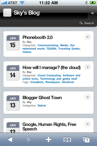
 About the WPtouch Mobile Plugin— I ran across this in the news sidebar on a blog I was editing this morning. It’s a WordPress plug-in (yes, it’s not actually a theme even though they refer to it that way sometimes) that converts a regular WP blog so that it reads nicely on a small/narrow screen (like that of an iPhone or iPodTouch). Using javascript (which does work on iPhones, unlike Flash) it lets you see first the titles of articles[1], then you can click a triangle to expand and see the short description, and click a triangle again to read the entire article. I had one problem[2] (so far) but I love what it does.
[If you’re reading this on an iPhone you’re already seeing how it works, if not you should feel free to pull out whatever your smartphone is and go to my blog home page to see how it works.]
When you visit a blog that has this plug-in enabled, if you’re on an iPhone (or some other smartphones) you’ll see a concise display of the most recent entries in the blog. It includes titles, dates, and categories only. [Illustration left.] My blog theme is white type against a black background, but the plug-in takes just the pertinent information and displays that using a substitute theme that looks fine on the iPhone screen.
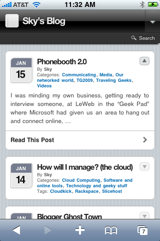
Then…  Then, if you tap the title of an article, it opens up to show you a short excerpt. [Illustration right, where I’ve selected Phonebooth 2.0 to expand.] It’s javascript, so the “opening up” is a smooth sliding open motion. Notice that my white-on-black theme has been replaced by a gray-on-white theme, which is easier to read on the small smartphone screen. It’s still using the body copy of my article, but re-theming it so it looks good.
Oh yeah, and if you don’t like the look on your smartphone, there’s a slider at the bottom of every page that lets you return to your regular site rather than use the WPtouch framework! And when you’re in the regular view, the slider is also at the bottom of every page so you can return to the WPtouch theme.

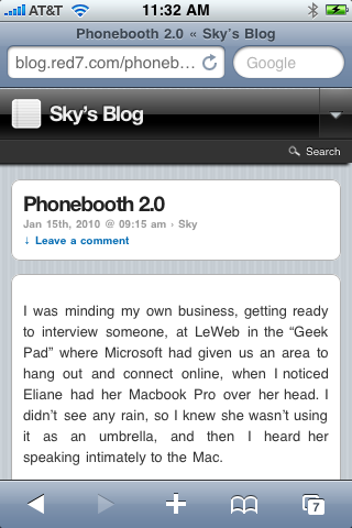
 If you like the preview of the article, you can tap to open the entire article. [Illustration left] Again, it’s in the WPtheme format, colors, backgrounds, and looks the way you’d expect an iPhone app to look, and I was surprised and happy that my white-on-black theme still looks great when translated this way!
Photos look OK, and embedded YouTube videos look OK, and on an iPhone they play (unlike many other video streams). Photo “alignment” doesn’t work, but I think I can fix that… This is really slick.
As I said, the only shortcoming right now[2] is that I can’t get to a page on my site if it’s only listed in the menus. (The top menus/tabs don’t appear.) If it’s linked within an article, then it’s OK and you can reach the page, and it in general looks fine (there are a few glitches), so I hope this will be fixed up in the near future. Meanwhile, it’s still a great idea and a great implementation.
The plug-in’s creators also show graphs proving that their plug-in reduces the loading time of sites, probably because it eliminates a lot of the heavy code overload that most WordPress sites carry with them.
[1] In case you hadn’t noticed, I prefer to call blog post an article instead. Probably because it’s more traditional-sounding, but using the word post sounds like I tacked it up on a telephone pole. “Posting a notice” as opposed to researching and writing an article.
[2] The problem is that there is no easy way to get to a page rather than just the posts on your blog. I’ll contact the developers and see if there’s anything I can do to help them enable this feature. Here’s a page that works— The Social Graph of Malware. Here’s a page that doesn’t— About the Photos.
Leave a Reply