Over the last year (most of 2020), the majority of my radio work has been focused on making my connections between packet radio and SFWEM even more resilient.
SFWEM.NET is the San Francisco Wireless Emergency Net, which is a mesh network that’s being built out by amateur radio operators with the intention of being a communications backup in time of emergency — when phone and data networks may be locally overwhelmed or not functional. Beside that, however, it’s an interesting experiment for amateur radio operators seeking to understand the benefits and limitations of “wi-fi” as a long-distance tool. [Read more…]

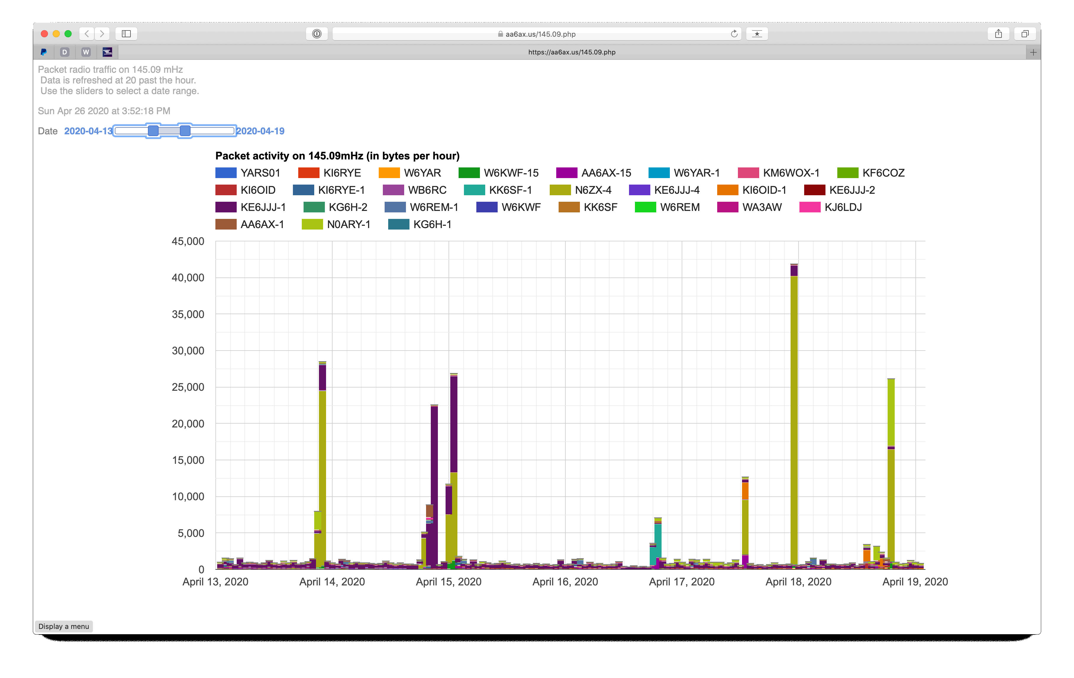 Very techie here… For a few months I’ve been operating a